But all newsletter popups are not created equal. The design, targeting or offer you choose will impact the number of emails that you’ll end up collecting.
Today I’d like to share what I’ve learned working with hundreds of top brands on their list-building strategy. No complex words, just simple techniques you can copy and apply right away.
Emailpopups give your signup forms a huge increase in visibility. Heatmap analysis shows that most web users never scroll down to the bottom of a web page.
Popups come with a lot of targeting and segmentation options. These options allow you to push targeted messages and offers that vastly increase your chances of building your email list fast.
Popupsoffer a lot of flexibility in terms of branded popup design. And yes, more creativity often means more leads
What Is a Good Conversion Rate for an Email Capture Popup?
Yes, popups do work. To know exactly how much they do, we analyzed the results of our 50 largest ecommerce clients.
The results? The average conversion rate of their email capture popups was 3.75%.
The main difference between the top performing and the lowest performing clients was the inclusion (or non-inclusion) of an offer (we’ll come back to this later in the article).
Convinced? Let’s now discuss how to craft the best email popup ever.
Customize your campaign (popup message, colors, structure) to fit the design of your website.
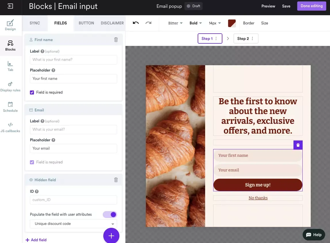
It's easy in Wisepops—just click the part you want to change and the settings will open:
Choose the Right Timing
Go to Display Rules > Trigger and choose when to show your campaign:
Here’s one of the AB tests created by a high-end hi-fi retailer.
They tried displaying the same exact popup on landing and after 2 pages. The popup displayed on landing ended up collecting twice as many emails as the one displayed after 2 pages. But the conversion rate of the popup displayed after 2 pages was twice the one of the form displayed on landing.
All in all, these tests show that the shorter the delay, the more emails you’ll end up collecting. But, as the conversion rate of your popup will be lower, it means you risk annoying a larger portion of your visitors.
How Do You Find the Sweet Spot?
The best way to identify the exact popup timing that maximizes the conversions while reaching a reasonable conversion rate is to run an AB test. You can test displaying your popups on landing, after 10 seconds, 20 seconds, etc.
If you don’t want to choose, you can also trigger your campaign when your users are about to leave your website with exit-intent popups.
Define Segments
To maximize your conversions, it’s important to design popups that speak to your visitors.
To do so, the easiest method is to segment your audience and create a specific popup for each of your segments.
Here’s a quick presentation of the two most popular segmentation methods.
Content Segmentation
When using this method, marketers adapt their popups to the page (or page category) that the user is browsing. This way, the popup copy and design are directly correlated to what the users see.
Here’s a real-life example on SohoHome’s website. They identified a specific segment – users interested in vintage furniture – and crafted a dedicated popup displayed only in the vintage category.
Here’s another one on Leesa.com. The popup they display is tailored to the exact page users are browsing:
And here’s a last illustration on ChristyDawn, where they display a specific popup form on out-of-stock product pages:
Segment Your Users by History
The second most popular way to segment campaigns is by visit count. A lot of our customers choose to create specific popups for new and returning visitors.
Why?
Because they can display a large popup with an enticing discount for users who are less familiar with their brand…and display a more subtle popup for users who have already visited the website and seen the first popup.
Here’s an example on Bonobos where the email subscription popup targets new visitors.
Targeting Takeaways:
AB test your popup timing. If you don’t have time for an AB test, create an exit popup.
Segment your campaigns by page or browsing history.
How to come up with an offer
How do you react when you see a popup yourself?
Do you rush to subscribe?
Chances are you don’t, and you usually weigh in the pros and cons of giving away your email address.
This is where your offer comes in. Let’s see what the best offers are.
Strategy #1: Coupons
Let’s save some time here.
According to our tests, coupons are THE most efficient way to convince your visitors to subscribe. Period.
Here’s an example of their impact on one of our customers’ campaigns:
By adding a $7 coupon, our client was able to capture four times more emails than without a discount.
But discounts are not the only option when it comes to coupons. Free shipping offers work great as well. According to a poll by Retention Science, 21.8% of US retailers judge them to be the most effective kind of offer.
Why not give it a try?
If you have a budget for coupons, go for them. If not, we have more options for you.
Strategy #2: Sweepstakes
Sweepstakes are the second highest-converting offers we’ve seen.
Their advantage? They’re usually cheaper and often work as well as discounts and other sales promotion examples.
One of our clients, a major shoe retailer, is running both “regular” popup campaigns with no offer alongside sweepstakes popup campaigns. Guess what? His sweepstakes campaigns generate three times more subscribers than his regular campaigns!
Here’s an example on Timberland’s website:
Strategy #3: Freebies (lead magnets)
Sometimes, offering exclusive content such as an ebook can be more valuable than a coupon or a gift. That’s especially true for B2B and SaaS companies.
The call-to-action is the other half of your popup copy.
We recommend you step into your visitor’s shoes and think about the main benefit that your users will get when they receive your emails. You’ll end up finding calls-to-action that go beyond the boring “Submit.”
Here are a few examples of compelling calls-to-action:
No offer > Join / Keep Me Posted / Keep me in the loop / Join the club / Count me in
Discount > Get my coupon / Send me the offer / Activate the offer / I want that
Freebie > Get the book / Download the book / Start learning / Send me the book
Mystery offer > Get my surprise
Copy Takeaways:
Choose your editorial angle carefully; you won’t have a second chance.
For your calls-to-action, choose a word that compels visitors to act
Use power words like “Activate” instead of generic words
How to make the design
Designing your popup is the last step of the process.
Let’s see how you can design the most convincing popup.
Google has shared precise guidelines on the matter. Mobile design popup practices suggest that if you want to avoid an SEO penalty, your popup shouldn’t prevent your visitors from accessing the main content of the page. In other words, it shouldn’t be too large.
Here’s an example of a mobile-friendly popup on Dickies:
See? Their banner is set to full width and its height is less than 250 pixels. That’s the size we recommend.
If you want more freedom, you can also add a trigger before your popup; this allows you to respect Google guidelines yet design a larger popup.
Here’s what it could look like:
On desktop, the situation is different. You’re free to choose your popup size.
A few elements can help you make a decision:
How visible you want your popup to be: the bigger your popup, the more difficult it would be for your users to miss it
How far are you prepared to go: the larger a popup, the more intrusive it could be for your visitors
As a rule of thumb, we recommend designing full-screen popups only when your popup is triggered on exit. Otherwise, you risk increasing your bounce rate.
Add Visuals
Now that you have picked a size, we can discuss visuals.
Visuals have specific benefits for an email capture popup:
Draw your user’s attention to your popup
Reassure your potential subscribers that it’s safe to share their email
Remind your visitors of the benefits of a subscription
Let’s see how you can leverage these benefits.
Again, mobile is very specific. As bandwidth and space are limited, we recommend avoiding visuals or sticking to small visuals.
On desktop, you can try one of the following strategies:
Strategy #1: Using a Product Visual
Using a product visual is particularly popular among online businesses like Shopify stores. It reminds the visitor of your brand mission while contributing to make your popup more appealing.
Strategy #2: Getting Personal
Using a picture of yourself can reassure your potential subscribers. To put it another way, you’re telling them, “We’re starting a discussion.” It works especially well for B2B websites and bloggers.
Here’s another example from a veteran marketer Neil Patel:
Depending on the offer you make for your subscribers (we’ll elaborate later in this article), it might be worth illustrating it directly into your popup.
See this popup from Practical Ecommerce below? It tells you right away what you’ll get when you subscribe.
Strategy #4: Adding Logos
Logos are great to provide social proof and to reassure. Here’s an example on Conversioner.com’s email lightbox.
Design a Call-to-Action That Stands Out
No click, no email. It’s that simple.
This is why you need to pay attention to your CTA design.
Pick the Right Color
Studies have shown that there’s no universal rule for CTA colors. They must be coordinated with your popup and website.
A few common sense recommendations can help, though:
Choose a color that is both eye-catching and helps your CTA stand out (different from the dominant color in your popup)
Choose a color that that matches your website
Here’s a good example on Weebly. The CTA is white and stands out from the rest of the popup.
Choose the Right Size
Anything which can help your call-to-action be noticed can help.
Bigger is not necessarily better. But make sure your CTA can’t be missed.
If you’re having doubts, don’t hesitate to run an AB test.
Here’s an example of large calls-to-action on Vincero Collective. The CTAs are as large as the email field itself.
Pawel is the Head of Growth at Wisepops and an expert in lead generation, popups, ecommerce, and onsite marketing.
With over a decade of experience in digital marketing and ecommerce, he has both build marketing teams from scratch and led strategic business growth projects.
Pawel has worked with countless online businesses on marketing strategies and is now sharing his knowledge. Previously, he was an head of growth at Tidio, where his responsibilities ranged from creating marketing materials to building acquisition channels.